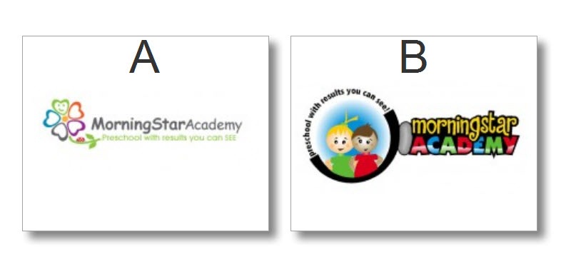
Help us choose a logo for MorningStar Academy Preschool
We’re trying to decide between these two logo’s. Instead of telling you the nit-picky things we like and don’t like, we’d like to ask your opinion.
What do you think?
Please Leave comments.
Thanks,
Scott and Jamie.

NO CHEATING ….
After you choose A or B above, AND … leave a comment 🙂 you can see all the logos we have to choose from on the LogoTournament Site.
http://www.logotournament.com/contests/morning_star_academy
OK … I decided to open a HIT on Mechanical Turk, and for $5.00 I was able to solicit 100 responses. The bad news here, is the general population seems to be split down the middle. Out of 100 votes, 51 people liked A, and 49 people liked B. Here are their responses.
51 Logo A Votes – Reason Description
- The faux-CGI look of B is sure to age (no pun intended) quickly. B also deemphasizes the name–you only see the kids.
- Logo A is classier, and the subtitle is easier to read than in the other one.
- The main message of the logo is not readable on B.
- It looks respectful and caring yet not cartoonish like the other one.
- If I were a mother who wants her child to use her time in preschool to learn traditional skills through traditional pedagogical means, I prefer A. It looks more serious in its educational role. However, if I see preschool as a place where my child can learn skills through play and observation, and where interacting with other children is more important than traditional rote learning, then B is more attractive. It sends the message that the preschool is all about fun and games and being with other children.
- A seems less busy and more elegant. It is still colorful, but the colors are not as distracting as B. The name of the Academy is also very clear in A.
- I think that it looks classier. B is more childlike, which is ok for a preschool, but I think that A makes a better impression and shows that you take educating and caring for the children more seriously.
- Looks cleaner, more professional and serious. I like that it doesn’t show children, so you are not representing just one race. Looks more academic.
- A is cleaner. You could use just the flower (or even just the green petal) on business cards and letterhead and it would still be recognizable. I’m not sure I’d use Comic Sans MC for the name though. B is much bolder, and would be better for a sign, but I don’t get the squishy gray thing between the kids and the title. I also find the curving tagline difficult to read and the other half of the circle is dark black because… ? I’d pick A but make the type a little punchier (not as strong as B, but stronger than it is now). Good luck!
- I like the pastels and the petals shaped like hearts. Looks like they would be taught with love.
- it is more soft and subtle. design B is loud and a bit jumbly and both the kid are white.
- It looks more professional than B.
- A is a much more professional looking image, and much less noisy to the eyes. The flower looks very clean and pleasing, whereas in B the text is a bit tough to read, and the picture looks messy.
- Since this is a logo for a preschool academy, the colors, font and the logo seem appropriate. The colors are softer in this one compared to the other logo, which appears too striking for the kind of service it is representing. Moreover, a flower as a logo is more child-friendly and easier on the eye.
- Logo A is nice and simple. When I think of a "logo" I think of something that is simple, recognizable, and memorable. Logo B is too busy, too much information to take in for a logo.
- This logo looks more feminine and thus would appeal to mothers, who are the majority of the clients that are going to be taking their children to this facility.
- A is better because of it’s clean design. B is full of black, which is hard and dirty in my mind. Preschool and black just don’t seem right together.
- More sophisticated, less hokey. Type could use some punching up: darker, less common font.
- One is simple and easy to read. I like B but it is too busy. There is too much going on.
- I like logo A better because it is more academic. Logo B looks a little like a coloring book cover. Not as professional.
- It is cleaner, simpler and easier to read while still conveying the colorful playfulness of a preschool.
- The ‘A’ logo is a little more grown up; The ‘B’ logo is too childish and makes me feel a little that I’m being talked down to, or slightly guilty that I don’t think every parent’s sunrise and sunset as their child.
- Logo B is "too busy" and the colors are too dark. When your tag phrase is "Preschool with results you can SEE," you can’t "see" your tag phrase in Logo B but it’s definitely visible in Logo A.
- Logo B is too cartoony. I assume the logo is meant to appeal to parents. The left one (Logo A) does this better.
- It for some reason it seems more friendly and approachable, which is important for me when children are involved.
- I just think A is a really cute logo. I like the colors and the graphics better than B. I’m not real fond of the images of the children in B and the colors are a little harsh.
- I liked choice A as it is sweet and simple and does not seem loud. The colors are bright without being loud and gawdy. Children too will love this logo for their school. It conveys relevant information about the field i.e. education.
- Its a cleaner look. The graphic of the flower is really good. Plus the mission statement flows better under the Academy’s name.
- Looks a lot more professional, well balanced graphic design.
- It looks more creative.
- It’s clean, clear, and stays relevant to children/child care while looking "adult" enough to represent a business.
- I like A better because it seems more professional and goes better with the tagline of "preschool with results you can SEE." The pale colors also play off of the young age of the children without being overly playful as in option B.
- Because it is simple and pleasing into eyes.
- Looks more professional, and I don’t like the gradient in ACADEMY in logo 2. Also the boy in logo 2 looks ill.
- i like the organic feel of option a. i like the flower–it feels like things are growing–young minds are growing, etc. i think the text could be more interesting graphically.
- While "B" is appealing, its appeal is basically to children. I chose "A" because the phrase "Preschool with results you can SEE" is more prominent and the general design is soothing and adult. And it is adults who will be choosing (and paying). It just seems more professional and serious. I also really like the name of the school and "A" presents a better version of that name.
- I like A better because it’s simple and pretty, but B isn’t bad at all!
- I prefer Logo A because it is far easier to read. Logo B at a glance seems unprofessional and kind of messy. Sometimes, less is more.
- It’s a simple logo (easier to use in marketing). Conveys a happy, loving environment.
- I like the first one better because it will appeal to both adults and children. Adults can appreciate the professional-looking logo of the first one, sprinkled with a touch of cutesy-ness. While the children will appreciate the little smile in one of the petals. The soft colors also complement the professional-looking logo and layout of the first one.
- Choice B looks like a Wii character knockoff. It also comes across as harsher than choice A. I find choice A comforting and friendly, soothing almost. It seems more welcoming than choice B.
- Image B looks like it came off a game or tv. You aren’t catering to the child when it comes to a daycare’s logo. You want parents to think its a place children can be nurtured.
- Logo A is simple and classy. Logo B is cartoonish to a fault.
- Logo A seems more appealing. It doesn’t have the black around it. I think when you think of a pre-school atmosphere, you think of vivid colors. The other attribute is that A looks more on the professional side.
- the script is neat and easily readable. also the flower with the hearts for petals is attractive. the whole picture is neat, concise, and quietyly attractive. it draws your eye but the logo is not too busy and overdrawn.
- Neither are great but the children in option B look kind of creepy. Not sure what dads would like about the heart/flower in option A though. Option A is easier to read and looks more professional.
- Logo A is very clean and professional looking. Logo B is very cartoonish and amature. Just by looking at the logos, I would assume A was a more trustworthy, higher quality preschool because they invested in a professional looking logo.
- It looks more professional. B is a little too busy and cutesy. A is both friendly-looking and simpler.
- Option looks understated, yet professional. The look would appeal to someone looking for a sophisticated and professional preschool. option B looks too cartoonish.
- "A" looks a bit more professional but still fun and colorful which makes it welcoming. It would draw my attention as a place I might want to consider more than "B" would.
- B is a little too busy. I think A wll be more flexible (look good and be readable in a variety of sizes, and would look OK if copied in B&W for example), Plus I just plain like the flower design which seems sweet, while the kids in B look too cartoonish and are "off" somehow
49 Logo B Votes – Reason Description
- More bold colors that stand out better from the page. The first one was too soft in the colors and it looked washed out.
- More friendly and childlike – brown haired child should have a smile, looks unhappy and confused.
- colorful and simple, easy to understand.
- For me it say kids are number one. Very colorful and draws the eye to it.
- Selection B is more colorful and cheerful. I feel that it is much more eye catching than selection A. Selection A seems to me to have a washed out appearance.
- It’s more colorful, and it goes well with the theme (results you can see).
- Clearly better looking with the children and vibrant colors
- This logo suits more for a preschool. It is colorful and I like the two kids. The two lovely and happy kids would make parents think that their kids will be happy in this preschool. Also it will be more obvious that this place is related to kids even without looking at the words.
- it attracts my attention more
- The font is bigger and the colors are brighter. Plus, B is more representative of a preschool and when used on an outdoor sign, it will assist people in finding the location of the preschool.
- Colorful. And the 2 kids in the picture explain what its about without words or better than a flower symbol does. The first one looks like it could be for a garden nursery + is harder to read in the green writing
- The second logo easily displays the purpose of the company without any descriptions. It is very visually appealing and easy to read.
- Logo B is better because of the actual representation of the business involved and also, more brighter and catchy than logo A. Since MorningStar Academy is a preschool, the logo B aptly portrays the two kids to convey the point.
- I like B because it’s bright and colorful and it’s more fitting with the product.
- Logo "b" seems more appealing to a pre-school. When I looked at it I pretty much knew that it was involving children and a school. The colors also are more relevant to children. The logo seems more inviting than the other logo.
- Image B is instantly recognizable as a children’s symbol and is colorful as well as bright and friendly-looking.
- Bolder colors seems to stand out more.
- Logo B is a brighter, more colorful logo and is more likely to spark intrest in ‘morning star acamedemy’.
- It’s more attention grabbing.
- It is bright and colorful. Looks like they would have fun there. They are saying they would learn alot by being there. Id send my children there.
- It looks more attractive and colourful than A. It shows children images in logo to indicate academy. so B is the best one.
- Brighter picture which I feel would appeal towards a toddler group. An d the second reason I ask my 3 year old which one he liked.
- seems more inviting.. a little more modern i think.. when i look at the first i see professionalism but i also see expensive… the other looks like something i would want my child to goto.. fun and at his level
- B. is more personal and friendly because it shows two little kids of different races but also incorporates important info.
- I think B is more modern and more eye checking. I like the brighter colors and I think it is more kid friendly and draws much more attention. Also, B is more original.
- Its more creative and colorful
- They’re both really good. A would be more versatile and easy to reproduce, but if this is not a concern I think B is much more attractive. It also conveys an obvious "preschool feeling"
- I like the bright, primary colors in the second logo better. Since it is for a preschool, the "little kid" look those colors provide just seem to work better, in my opinion.
- The second one show kids and to me that shows more what the business is about. Someone can look at the logo quickly and know that the academy is for children.
- More colorful and eye catching. I also like the drawing of the 2 little children.
- I like the bold colors, the font, and the picture of the happy kids. Parents want their kids to be happy at day care, knowing that they have to be there because the parents need to work. My son is at aftercare after he gets off school at two pm every day and given a choice between the two logos at the top of this page, I would pick the second one over the first one, all other things being equal.
- Although I liked A as it is easier to read, the happy children in the B choice clearly show that the business is about children. And I like the bright and cheerful colors.
- I like B because it is bright,and shows what service you are selling.
- The colors are great for a preschool. I like that there is a picture with children except the brown haired is goofy looking. It’s funner and more memorable and noticeable.
- Create a much better appeal for the kids
- The pictures of teh kids tell me just what it is. The jelly bean shape between the circle and the words is odd.
- B because A looks too grown-up and serious for a preschool.
- B is much more colorful and seems much more fun!
- Its very colorful and catching to eyes. I liked the cartoons.
- More colorful than A much more interesting looking
- I liked b better because of the graphics. Also since it relates to preschool it would b e better to use the kids instead of a flower
- B is more kid-friendly…A-looks like it might be for a nursery…like a plant nursery…I like the magnifying glass concept..and the cross in the background….you might want to think about adding a boy to the group….just a thought!
- I think this logo looks more fun and friendly. It shows kids having a good time and I think that is an important messge to send even if its subtle
- Much more colorful and attention grabbing
- I prefer Logo B because it looks more preschool like. I think option B would speak more to the parents of a preschooler than A would. The colors are bright and cheery and stand out more. I think option B would look great on a T-shirt.
- B is more cuter
- Magnifying glass works well with the tagline.
- A couple of reasons right off the bat. First, the "results you can see" line is hard to see in example "A". Second, the bright colors in "B" seem to correspond with the way preschoolers see the world – all bright and exciting and so forth.
- it is very colourful and attractive.


