Archives for March 2009

Live Info Casting of #MIX09

Notes from the #Mix09 Key – Newest notes on top. Ready from the bottom up.

——

——

@ScottGu – Just announced support for Silverlight 3 outside the browser on win and the mac.

Built in auto update support. Dev can change it – update the server – SL3 will auto detect / update / install and start using the new application.

Offline aware support in SL3.

Event to be raised when the network status changes.

Offline data support!

————

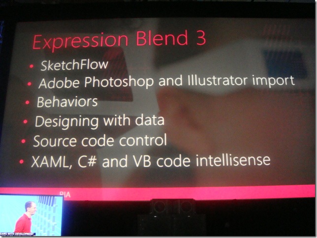
Blend 3 has native import of Adobe PhototShop and Illustrator files.

Saves the layer support, merge layers, etc.

———–

DSC03095 DSC03096 DSC03097 DSC03098 DSC03099 DSC03100 DSC03101

Ship the protoype to client with a free runtime / viewer / player – can run and collect feedback.

 DSC03102 DSC03103 DSC03104 DSC03105

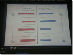
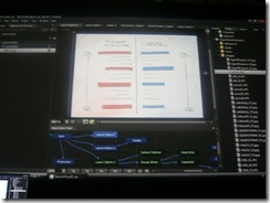
Protyping with Blend 3 Sketch Flow

———–

DSC03094

10:41 Scott Gu Back on Stage. Talking about Expression Blend 3 – Sketch Flow.

——

this summer is releasing a new site http://CoverToCover.com


Excited to announce… a new site, a new concept. Will go live later tonight ….

http://PlayBoyArchive.com launching this evening with 54 free issues using the technology.

——-

@10:37 – Scott from VERTIGO showing how they’re using SL3 to browse old rags, with a Rolling Stones demo. Deep linking demo to send a specific page to a friend.

——

DSC03093

———

DSC03088 DSC03089 DSC03090 DSC03091 DSC03092  DSC03087

————-

DSC03086

10:27 SL3 News. GPU Accelration, Perpective 3D, Bitmap & Pixel API, Pixel Shader + Deep Zoom

———

10:21 Perkins Miller Sr. VP Digital Media for the Beijing Olympics. Huge traffic volumes, not only during the Olympics, but for the weeks after. The Advertisers were very happy. Users who used the enhanced experiences, ended up watching more regular TV. The online presence made them happier, more engaged, and also ended up watching the television. Again, good for everyone.

Will be able to use the pause, rewind, slow motion, + full meta data overlays.

Olympics will also have a Silverlight relationship for the Winter Olympics next year in Vancouver, Canada.

Will have the ability to do live ad insertions.

331 days to go until the next winter Olympics 🙂

——

10:20 New player / IIS Streaming / Has a record behind, with pause for live video, the new web server, automatically archive the video being displayed. give the ability to rewind a live event, pause a live event. Very cool

———

10:16 –Gu Demo – Import AVI, h.264, vc1, mpeg3, mpeg4 , showing off the live streaming, the encoding, and

DSC03077 DSC03078 DSC03079 DSC03080 DSC03081 DSC03082 DSC03083 DSC03084 DSC03085

———-

10:13 Gu back on Stage. SL3 – Enables hardware graffics acceleration – both Windows + Mac. Deliver true HD Quality Media.

DSC03076

NEW Codec support. MPeg-4, H.264, AAC

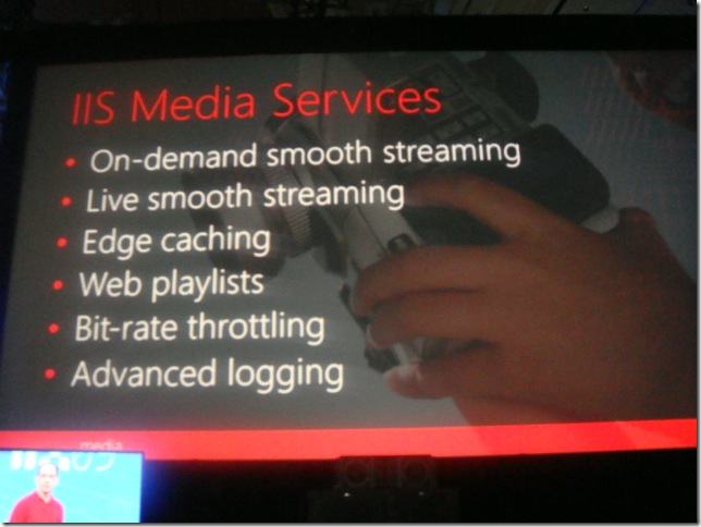
Also excited to announce, IIS Media Services platform. One click install from the web platform shown earlier.

On demand smooth streaming, Edge caching, web playlists, bit rate throttling, and advanced logging.

Shipping support for LIVE Smooth Streaming. Released today in Beta form.

———

DSC03070 DSC03072 DSC03073 DSC03074

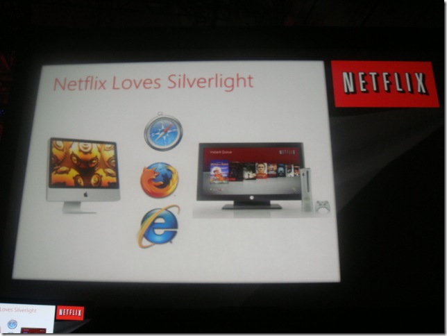
Kevin McEntee – Talks about how great Silverlight is for NetFlix. Users do not like to do installers. 12% won’t install. 8% that do try, fail. that’s a 20% failure rate on the old installers.

With the Silverlight installers things are much better.

Now Netflix is out of the installer business. Content protection is built into Silverlight.

Able to rev the NetFlix player every two weeks – in the old days – the player couldn’t be udpated because of the new install. So the player just keeps getting better and better – because a new player doesn’t require a new installer – ITS BUILT ON SILVERLIGHT 🙂 Such a great success story.

——

10:01 @ScotGu back on stage – Talking about Silverlight 3

-bottom: 0px; border-left: 0px; display: inline; border-top: 0px; border-right: 0px” title=”DSC03069″ border=”0″ alt=”DSC03069″ width=”644″ height=”484″ src=”https://scottcate.com/wp-content/uploads/2012/11/live35.jpg”

New Silverlight Virtual Earth SDK.

10’s of thousands of sites aroudn the world

——–

Joel Spolsky – Talking more about how BizSpark helped them get started. Didn’t want to build StackOverflow for a ton of money, they built it as a prototype.

Kind of a http://StackOverflow.com commercial now.

———

Jeff Atwood trying to push OpenId

asp.net routing – mans the urls are pretty, clean, simple, and just make sense.

performance, performance, performance


——–

DSC03066 DSC03067 DSC03065

9:54 Invite Jeff Atwood – Joel Spolksy hit the stage.

———

9:53 Bizspark – Enable Startups. http://Microsoft.com/Bizspark

Access to microsoft software.

free licenses.

any product license for first 3 years.

lower initial startup costs.

program includes additional marketing + bix dev

godaddy / rackspace / teir 1 – offer free hosting for BizSpark startups.

———-

9:51 commerce server 209 release – new version this week.

Host applications in the cloud – SQL services now support relational database Raw ADO.NET support.

.NET full trust ( this was a huge upgrade from the original .net medium trust )

———–

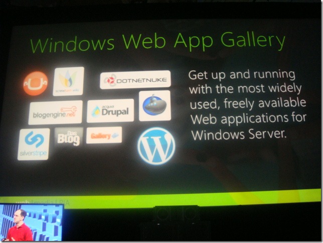
Installer now with web sites.

http://Microsoft.com/Web/Gallery/default.aspx

An online app store – all free – and one click installer – used the web platform installer.

dev hosts their own stuff. the instal bits come from dev servers, just hosted on the app store.


DSC03060 DSC03061 DSC03062 DSC03063 DSC03064


————–

DSC03059

The @Umbraco team is happy to have their logo on screen 🙂

———-

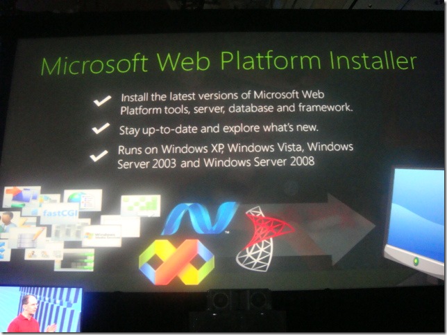
9:43 Common theme – alot of new technology – how do i figure out all the new technolgoies.

today we’re shipping V2 of Web Platform installer.

provides a unified list of all the microsoft web.stack

DSC03058

http://Microsoft.com/Web

———-

DSC03057

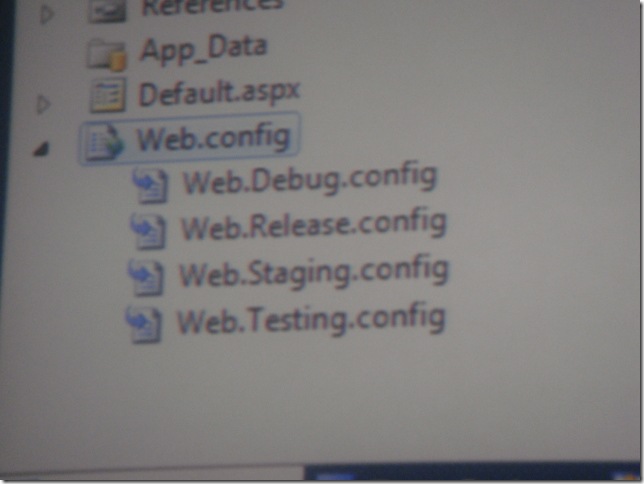
9:42 – Multiple web.cofig support

——-

9:41 Code focused features – lots of editor improvements

———-

9:40 asp.net 4 improvements. distributed caching – velocity, ajax, mvc, and web forms.

——

Visual Studio 2010 javascript / ajax / jquery / sharepoint major imporvements

——-

9:39 – ASP.NET MVC 1.0 RTM. This was known earlier this week.

——–

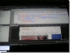
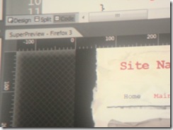
9:38 Super Preview is available today – as a stand alone version – should be available now.

——–

New product – that shows ALL browsers at once.

SUPER PREVIEW – new Feature in Expression Blend

Can use cloud service – to get images of html from browsers in Microsoft cloud

DSC03056

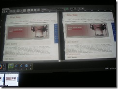
This isn’t out of focus – it’s showing two browsers overlayed on each other. what’s cool about this above photo, is that the overlay is safari on a mac. yes a mac. it’s an image that was returned from a cloud service, that has a mac running, the html is rendered, and the image is returned and overlayed.

VERY COOL.


 DSC03049 DSC03050 DSC03051 DSC03052

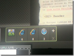
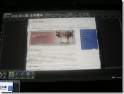
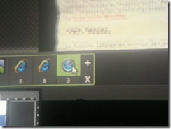
see content in side-by-side. Test ie6, ie7, ie8 on a single machine.

DSC03053 DSC03054 DSC03055

9:33 How do you build a CSS / HTML – Super Preview Demo

————


DSC03048

——————

——————-

9:27 Buy Steve, Welcome video for ScottGu.

(I have the video – will post later)

Standards based web.

——————

DSC03045

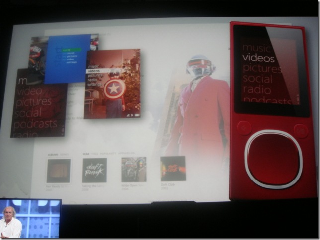
Briefly talk about how 9 months from zero to scratch was pretty amazing. not that zune is better than iPod – but how zero to final in 9 months was a big deal.

——–

9:23 Microsoft is bringing on more and more (800) designers

——–
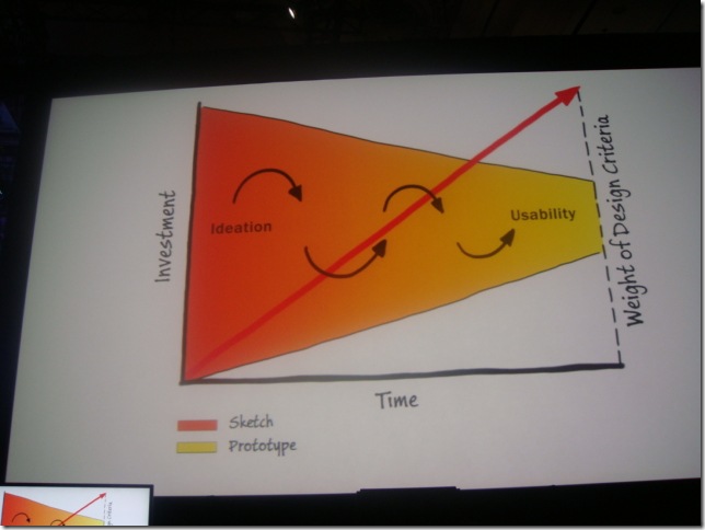
 DSC03044

9:20 Someday we’ll have tools – with renderings, states, and transitions. ( HERE IT COMES >>>> )

————–

9:19 Need as much details in the transitions, as you do in the states. The transitions are very important. Without the transitions, it’ll fail.

————–

DSC03043

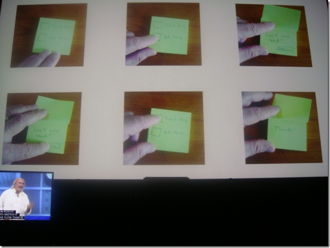
9:18am Do it with post it notes – much faster than any technology.

————–

DSC03042

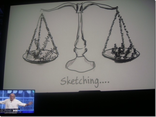
9:17. Starting to talk about Sketching. I think this is linking into a product

————–

 DSC03041

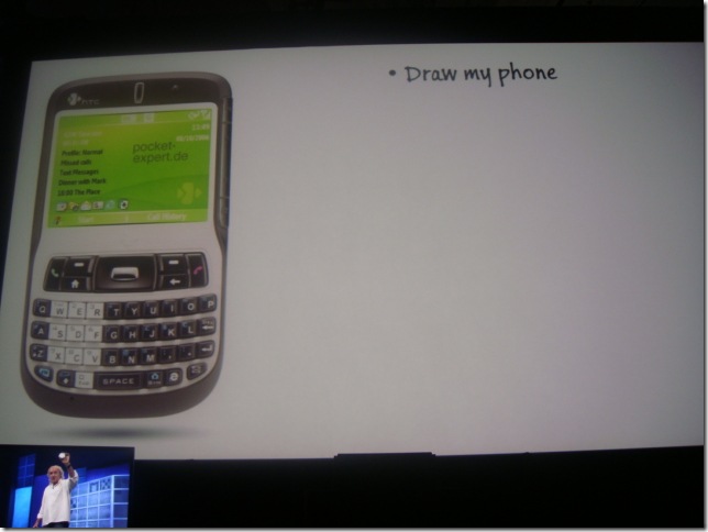
9:13am – Draw my phone. Easy.

Draw the User Interface. Really Hard.

Draw the Experience. impossible.


————–

  DSC03040

————–

 DSC03039

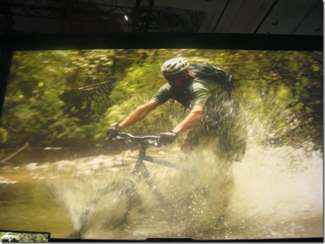
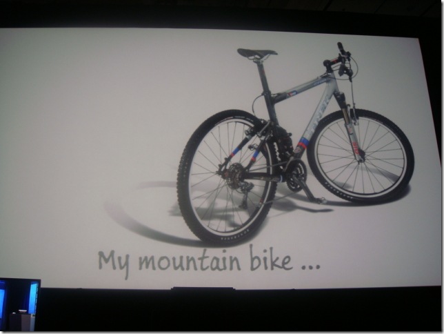
9:12 Talk about this bike ad – vs. the bike running through the water.

————–

9:08 General Message == Return on Experience.

————–

DSC03038

9:02 Bill Buxton takes the stage – Focus on Experience.

———-

DSC03036

9:00 Show is about to begin – just hooked up with the @Umbraco crowd

————

DSC03035

8:54 Trying to find the right picture size – trying 640X480 now. Going with a native 640X480 size.

the hall has 2500 seats – not sure how many are in attendance

———-
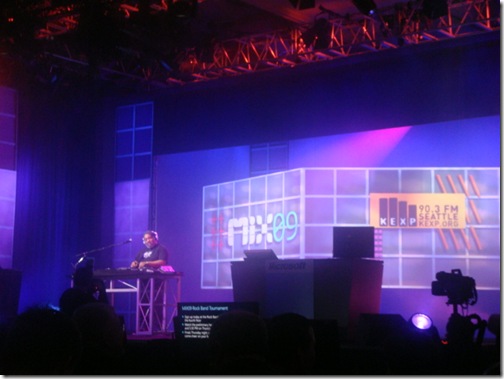
DSC03034

8:51 Live DJ on stage

——

DSC03033 

8:44 – Sending Twitter updates with #Mix09 tag – will show up in the keynote as we’re waiting.

——

If you’re not able to Make it to Microsoft’s MIX09 conference this year, I have good news for you. I’ll be ( let’s call it ) live casting several of the sessions, mainly the keynotes. Images + Quick notes will let you instantly know what’s being announced.

There will be several ways to virtual attend … I’m sure Microsoft will be posting the keynotes in video form, like they have in the past; but I’m not sure it’ll be live. I’ll be posting pictures + short notes as live/fast as I can from the keynote sessions.

Setup a twitter account (if you don’t have one already) and Follow @ScottCate

Alternatively you can bookmark this page –> http://ScottCate.com/Blog/LiveMIX09 and the during the conference it will Live Update with details as they are delivered.

This work is licensed under a Creative Commons license.

Help us choose a logo for MorningStar Academy Preschool

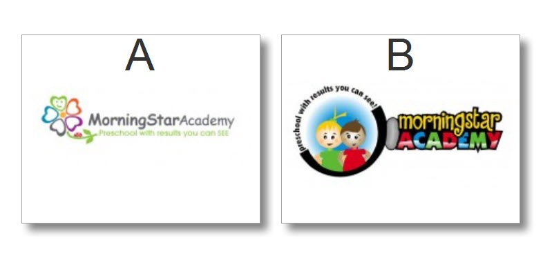
We’re trying to decide between these two logo’s. Instead of telling you the nit-picky things we like and don’t like, we’d like to ask your opinion.

What do you think?

Please Leave comments.

Thanks,

Scott and Jamie.

MSA_LogoContest

NO CHEATING ….

After you choose A or B above, AND … leave a comment 🙂 you can see all the logos we have to choose from on the LogoTournament Site.

http://www.logotournament.com/contests/morning_star_academy

OK … I decided to open a HIT on Mechanical Turk, and for $5.00 I was able to solicit 100 responses. The bad news here, is the general population seems to be split down the middle. Out of 100 votes, 51 people liked A, and 49 people liked B. Here are their responses.

51 Logo A Votes – Reason Description

  1. The faux-CGI look of B is sure to age (no pun intended) quickly. B also deemphasizes the name–you only see the kids.
  2. Logo A is classier, and the subtitle is easier to read than in the other one.
  3. The main message of the logo is not readable on B.
  4. It looks respectful and caring yet not cartoonish like the other one.
  5. If I were a mother who wants her child to use her time in preschool to learn traditional skills through traditional pedagogical means, I prefer A. It looks more serious in its educational role. However, if I see preschool as a place where my child can learn skills through play and observation, and where interacting with other children is more important than traditional rote learning, then B is more attractive. It sends the message that the preschool is all about fun and games and being with other children.
  6. A seems less busy and more elegant. It is still colorful, but the colors are not as distracting as B. The name of the Academy is also very clear in A.
  7. I think that it looks classier. B is more childlike, which is ok for a preschool, but I think that A makes a better impression and shows that you take educating and caring for the children more seriously.
  8. Looks cleaner, more professional and serious. I like that it doesn’t show children, so you are not representing just one race. Looks more academic.
  9. A is cleaner. You could use just the flower (or even just the green petal) on business cards and letterhead and it would still be recognizable. I’m not sure I’d use Comic Sans MC for the name though. B is much bolder, and would be better for a sign, but I don’t get the squishy gray thing between the kids and the title. I also find the curving tagline difficult to read and the other half of the circle is dark black because… ? I’d pick A but make the type a little punchier (not as strong as B, but stronger than it is now). Good luck!
  10. I like the pastels and the petals shaped like hearts. Looks like they would be taught with love.
  11. it is more soft and subtle. design B is loud and a bit jumbly and both the kid are white.
  12. It looks more professional than B.
  13. A is a much more professional looking image, and much less noisy to the eyes. The flower looks very clean and pleasing, whereas in B the text is a bit tough to read, and the picture looks messy.
  14. Since this is a logo for a preschool academy, the colors, font and the logo seem appropriate. The colors are softer in this one compared to the other logo, which appears too striking for the kind of service it is representing. Moreover, a flower as a logo is more child-friendly and easier on the eye.
  15. Logo A is nice and simple. When I think of a "logo" I think of something that is simple, recognizable, and memorable. Logo B is too busy, too much information to take in for a logo.
  16. This logo looks more feminine and thus would appeal to mothers, who are the majority of the clients that are going to be taking their children to this facility.
  17. A is better because of it’s clean design. B is full of black, which is hard and dirty in my mind. Preschool and black just don’t seem right together.
  18. More sophisticated, less hokey. Type could use some punching up: darker, less common font.
  19. One is simple and easy to read. I like B but it is too busy. There is too much going on.
  20. I like logo A better because it is more academic. Logo B looks a little like a coloring book cover. Not as professional.
  21. It is cleaner, simpler and easier to read while still conveying the colorful playfulness of a preschool.
  22. The ‘A’ logo is a little more grown up; The ‘B’ logo is too childish and makes me feel a little that I’m being talked down to, or slightly guilty that I don’t think every parent’s sunrise and sunset as their child.
  23. Logo B is "too busy" and the colors are too dark. When your tag phrase is "Preschool with results you can SEE," you can’t "see" your tag phrase in Logo B but it’s definitely visible in Logo A.
  24. Logo B is too cartoony. I assume the logo is meant to appeal to parents. The left one (Logo A) does this better.
  25. It for some reason it seems more friendly and approachable, which is important for me when children are involved.
  26. I just think A is a really cute logo. I like the colors and the graphics better than B. I’m not real fond of the images of the children in B and the colors are a little harsh.
  27. I liked choice A as it is sweet and simple and does not seem loud. The colors are bright without being loud and gawdy. Children too will love this logo for their school. It conveys relevant information about the field i.e. education.
  28. Its a cleaner look. The graphic of the flower is really good. Plus the mission statement flows better under the Academy’s name.
  29. Looks a lot more professional, well balanced graphic design.
  30. It looks more creative.
  31. It’s clean, clear, and stays relevant to children/child care while looking "adult" enough to represent a business.
  32. I like A better because it seems more professional and goes better with the tagline of "preschool with results you can SEE." The pale colors also play off of the young age of the children without being overly playful as in option B.
  33. Because it is simple and pleasing into eyes.
  34. Looks more professional, and I don’t like the gradient in ACADEMY in logo 2. Also the boy in logo 2 looks ill.
  35. i like the organic feel of option a. i like the flower–it feels like things are growing–young minds are growing, etc. i think the text could be more interesting graphically.
  36. While "B" is appealing, its appeal is basically to children. I chose "A" because the phrase "Preschool with results you can SEE" is more prominent and the general design is soothing and adult. And it is adults who will be choosing (and paying). It just seems more professional and serious. I also really like the name of the school and "A" presents a better version of that name.
  37. I like A better because it’s simple and pretty, but B isn’t bad at all!
  38. I prefer Logo A because it is far easier to read. Logo B at a glance seems unprofessional and kind of messy. Sometimes, less is more.
  39. It’s a simple logo (easier to use in marketing). Conveys a happy, loving environment.
  40. I like the first one better because it will appeal to both adults and children. Adults can appreciate the professional-looking logo of the first one, sprinkled with a touch of cutesy-ness. While the children will appreciate the little smile in one of the petals. The soft colors also complement the professional-looking logo and layout of the first one.
  41. Choice B looks like a Wii character knockoff. It also comes across as harsher than choice A. I find choice A comforting and friendly, soothing almost. It seems more welcoming than choice B.
  42. Image B looks like it came off a game or tv. You aren’t catering to the child when it comes to a daycare’s logo. You want parents to think its a place children can be nurtured.

  43. Logo A is simple and classy. Logo B is cartoonish to a fault.
  44. Logo A seems more appealing. It doesn’t have the black around it. I think when you think of a pre-school atmosphere, you think of vivid colors. The other attribute is that A looks more on the professional side.
  45. the script is neat and easily readable. also the flower with the hearts for petals is attractive. the whole picture is neat, concise, and quietyly attractive. it draws your eye but the logo is not too busy and overdrawn.
  46. Neither are great but the children in option B look kind of creepy. Not sure what dads would like about the heart/flower in option A though. Option A is easier to read and looks more professional.
  47. Logo A is very clean and professional looking. Logo B is very cartoonish and amature. Just by looking at the logos, I would assume A was a more trustworthy, higher quality preschool because they invested in a professional looking logo.
  48. It looks more professional. B is a little too busy and cutesy. A is both friendly-looking and simpler.
  49. Option looks understated, yet professional. The look would appeal to someone looking for a sophisticated and professional preschool. option B looks too cartoonish.
  50. "A" looks a bit more professional but still fun and colorful which makes it welcoming. It would draw my attention as a place I might want to consider more than "B" would.
  51. B is a little too busy. I think A wll be more flexible (look good and be readable in a variety of sizes, and would look OK if copied in B&W for example), Plus I just plain like the flower design which seems sweet, while the kids in B look too cartoonish and are "off" somehow

49 Logo B Votes – Reason Description

  1. More bold colors that stand out better from the page. The first one was too soft in the colors and it looked washed out.
  2. More friendly and childlike – brown haired child should have a smile, looks unhappy and confused.
  3. colorful and simple, easy to understand.

  4. For me it say kids are number one. Very colorful and draws the eye to it.
  5. Selection B is more colorful and cheerful. I feel that it is much more eye catching than selection A. Selection A seems to me to have a washed out appearance.
  6. It’s more colorful, and it goes well with the theme (results you can see).
  7. Clearly better looking with the children and vibrant colors
  8. This logo suits more for a preschool. It is colorful and I like the two kids. The two lovely and happy kids would make parents think that their kids will be happy in this preschool. Also it will be more obvious that this place is related to kids even without looking at the words.
  9. it attracts my attention more
  10. The font is bigger and the colors are brighter. Plus, B is more representative of a preschool and when used on an outdoor sign, it will assist people in finding the location of the preschool.
  11. Colorful. And the 2 kids in the picture explain what its about without words or better than a flower symbol does. The first one looks like it could be for a garden nursery + is harder to read in the green writing
  12. The second logo easily displays the purpose of the company without any descriptions. It is very visually appealing and easy to read.
  13. Logo B is better because of the actual representation of the business involved and also, more brighter and catchy than logo A. Since MorningStar Academy is a preschool, the logo B aptly portrays the two kids to convey the point.
  14. I like B because it’s bright and colorful and it’s more fitting with the product.
  15. Logo "b" seems more appealing to a pre-school. When I looked at it I pretty much knew that it was involving children and a school. The colors also are more relevant to children. The logo seems more inviting than the other logo.
  16. Image B is instantly recognizable as a children’s symbol and is colorful as well as bright and friendly-looking.
  17. Bolder colors seems to stand out more.
  18. Logo B is a brighter, more colorful logo and is more likely to spark intrest in ‘morning star acamedemy’.
  19. It’s more attention grabbing.
  20. It is bright and colorful. Looks like they would have fun there. They are saying they would learn alot by being there. Id send my children there.
  21. It looks more attractive and colourful than A. It shows children images in logo to indicate academy. so B is the best one.
  22. Brighter picture which I feel would appeal towards a toddler group. An d the second reason I ask my 3 year old which one he liked.
  23. seems more inviting.. a little more modern i think.. when i look at the first i see professionalism but i also see expensive… the other looks like something i would want my child to goto.. fun and at his level
  24. B. is more personal and friendly because it shows two little kids of different races but also incorporates important info.
  25. I think B is more modern and more eye checking. I like the brighter colors and I think it is more kid friendly and draws much more attention. Also, B is more original.
  26. Its more creative and colorful
  27. They’re both really good. A would be more versatile and easy to reproduce, but if this is not a concern I think B is much more attractive. It also conveys an obvious "preschool feeling"
  28. I like the bright, primary colors in the second logo better. Since it is for a preschool, the "little kid" look those colors provide just seem to work better, in my opinion.
  29. The second one show kids and to me that shows more what the business is about. Someone can look at the logo quickly and know that the academy is for children.
  30. More colorful and eye catching. I also like the drawing of the 2 little children.
  31. I like the bold colors, the font, and the picture of the happy kids. Parents want their kids to be happy at day care, knowing that they have to be there because the parents need to work. My son is at aftercare after he gets off school at two pm every day and given a choice between the two logos at the top of this page, I would pick the second one over the first one, all other things being equal.
  32. Although I liked A as it is easier to read, the happy children in the B choice clearly show that the business is about children. And I like the bright and cheerful colors.
  33. I like B because it is bright,and shows what service you are selling.
  34. The colors are great for a preschool. I like that there is a picture with children except the brown haired is goofy looking. It’s funner and more memorable and noticeable.
  35. Create a much better appeal for the kids
  36. The pictures of teh kids tell me just what it is. The jelly bean shape between the circle and the words is odd.
  37. B because A looks too grown-up and serious for a preschool.
  38. B is much more colorful and seems much more fun!
  39. Its very colorful and catching to eyes. I liked the cartoons.
  40. More colorful than A much more interesting looking
  41. I liked b better because of the graphics. Also since it relates to preschool it would b e better to use the kids instead of a flower
  42. B is more kid-friendly…A-looks like it might be for a nursery…like a plant nursery…I like the magnifying glass concept..and the cross in the background….you might want to think about adding a boy to the group….just a thought!
  43. I think this logo looks more fun and friendly. It shows kids having a good time and I think that is an important messge to send even if its subtle
  44. Much more colorful and attention grabbing
  45. I prefer Logo B because it looks more preschool like. I think option B would speak more to the parents of a preschooler than A would. The colors are bright and cheery and stand out more. I think option B would look great on a T-shirt.
  46. B is more cuter
  47. Magnifying glass works well with the tagline.
  48. A couple of reasons right off the bat. First, the "results you can see" line is hard to see in example "A". Second, the bright colors in "B" seem to correspond with the way preschoolers see the world – all bright and exciting and so forth.
  49. it is very colourful and attractive.

#67 Search in hidden text in the editor?

Ever try to search for something you know exists, BUT … the Quick Find just can’t find it? Is it possible that the text you’re looking for is in a hidden region? This video shows you how toe search hidden text in collapsed regions.

[CTRL]+[F] brings up the Find and Replace tool window.  You can then expand the Find options chevron control and select Search hidden text.  This is usually the first option I always set (or ensure is set)

#66 Using Quick find in the Current Document

The standard keyboard shortcut for finding text in most applications is CTRL+F. In Visual Studio, this kicks off a Quick Find in the current document. Quick Find will pre-populate the find what text with whatever text is selected in the editor or the word that the cursor is currently on.

Additionally, this find and replace window is actually a tool window (not a dialog), meaning that you can dock it somewhere and type in the editor with it opened.

This work is licensed under a Creative Commons license.

#65 Edit.WordComplete via Intellisense

Whenever you can invoke statement completion, you can also execute the Edit.CompleteWord command.  This command will complete a word that is partially complete with no other possibilities.  And if there are other multiple possibilities, the command will invoke statement completion.

[CTRL]+[Space] or [ALT]+[RIGHT]

This work is licensed under a Creative Commons license.